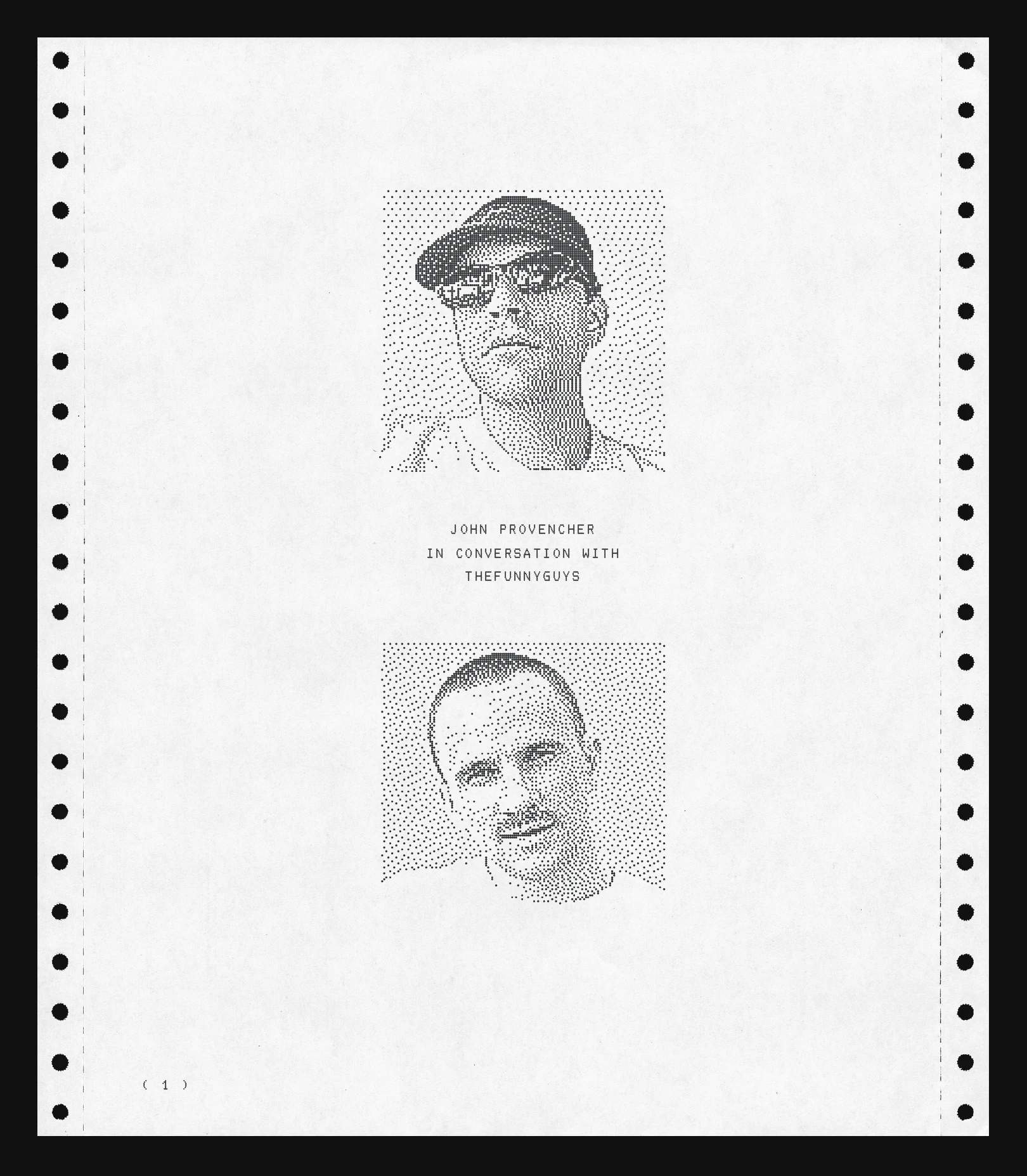
John Provencher
In Conversation With
thefunnyguys
( 1 )
Price0.01 ETH
Raster is a marketplace for on-chain digital art, founded by Michael
Elsdoerfer and thefunnyguys (Jan) in early 2025 and publicly announced on
September 3rd, 2025. John Provencher has contributed to the design of Raster
since before its launch and created its generative logo system.
In the following conversation, John and Jan discuss the development of the
system, the ideas and inspirations behind it, and their collaboration over the
past year.
( 2 )
Jan: Hi John! It’s been a while since we first started this project. How did
that happen again?
John: Hello :-} Hmm I remember the project being introduced to me as a
generative logo that would also function as a sort of graphic identity
for the site. It seemed cool.. and it seemed like an idea that I
haven’t seen really. I spent the early part of my practice as a graphic
designer so it really appealed to me to make a logo that was truly a
generative system.
The first sketches were centered around designing a static logo concept
and the art direction/design for the Raster website. The most obvious
idea was; how can we create a graphic identity from a simple grid
inspired by the idea of rastered images (grids of pixels to make an
image) .. I thought it was cool that the logo, the website, and the
generative work all grow from the same concept.
Is that how you remember it?
( 3 )
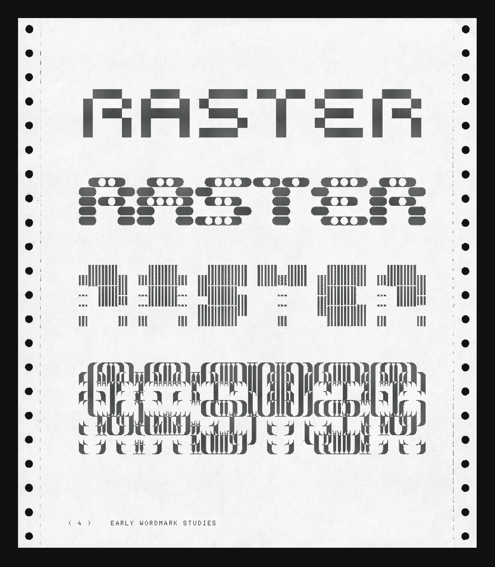
( 4 ) EARLY WORDMARK STUDIES
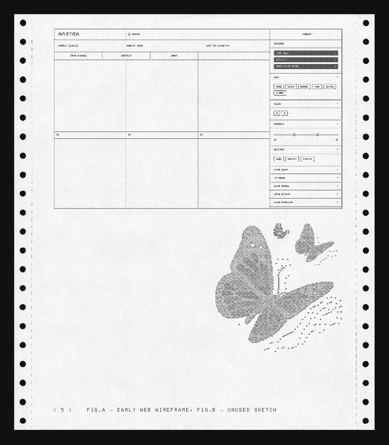
( 5 ) FIG.A — EARLY WEB WIREFRAME, FIG.B — UNUSED SKETCH
Jan: Yes, I remember Michael and me talking about doing things a bit
differently on the front-end. There’s a typical “marketplace” aesthetic
that we knew we wanted to stay away from. We had already landed on the
Raster name and had some vague design ideas in our head: “leaning into
a grid aesthetic”, “logo / front-end design should not compete for
attention with the art”, … But we didn’t know exactly what this should
look like.
So we started looking for artists with design experience to help us out
and from there it didn’t take long before we reached out to you.
How did you go from the static logo to this generative system?
John: I had an initial sketch where I took the bitmap wordmark but scaled and
rounded each pixel randomly and used some svg clipping to get some
interesting outcomes. That served as the basis for the project..
One thing I was keen on was moving away from some of the more obvious
visualizations of the word Raster. The work actually becomes much more
vector-based. The logo is made from SVGs, which is a vector graphics
commonly used for logos, so although it starts with a pixel, that pixel
can start taking advantage of all these other things that SVG allows.
The real challenge was creating something to house many outputs within
72 active grid cells to create something interesting.
( 6 )
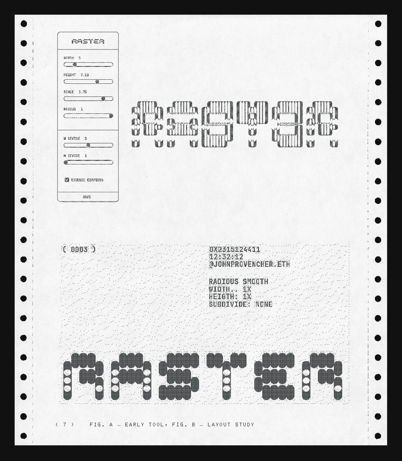
( 7 ) FIG. A — EARLY TOOL, FIG. B — LAYOUT STUDY
Jan: When I first saw the system it took me back to early explorations we
did with Marcelo Soria-Rodriguez at Le Random. We were talking about
MIT Media Lab’s generative logo and the logo of this opera house I
forgot the name of. In the end we didn’t make Le Random’s logo
generative, but Marcelo did create a beautiful system called Aleatoria
that still welcomes visitors on our homepage.
As far as I remember, the logo systems I then looked at all output
permutations of geometric shapes with a static wordmark next to it. Our
generative typography system is quite different as it collapses the
two.
I’m curious if you had any references in mind in the early stages?
John: Yea there’s definitely some modernist design influence like Wolfgang
Weingart and Wim Crouwel, Neville Brody … There’s this typeface by
Neville Brody called “Blur” that i’ve always liked and you can start to
see some outputs that resemble this. But it’s cool that the outputs
have some really modern looking influence into some more post-modern
ones. It was fun to connect the graphic design part of my practice so
this project was a way of returning to some of that through generative
software.
( 8 )
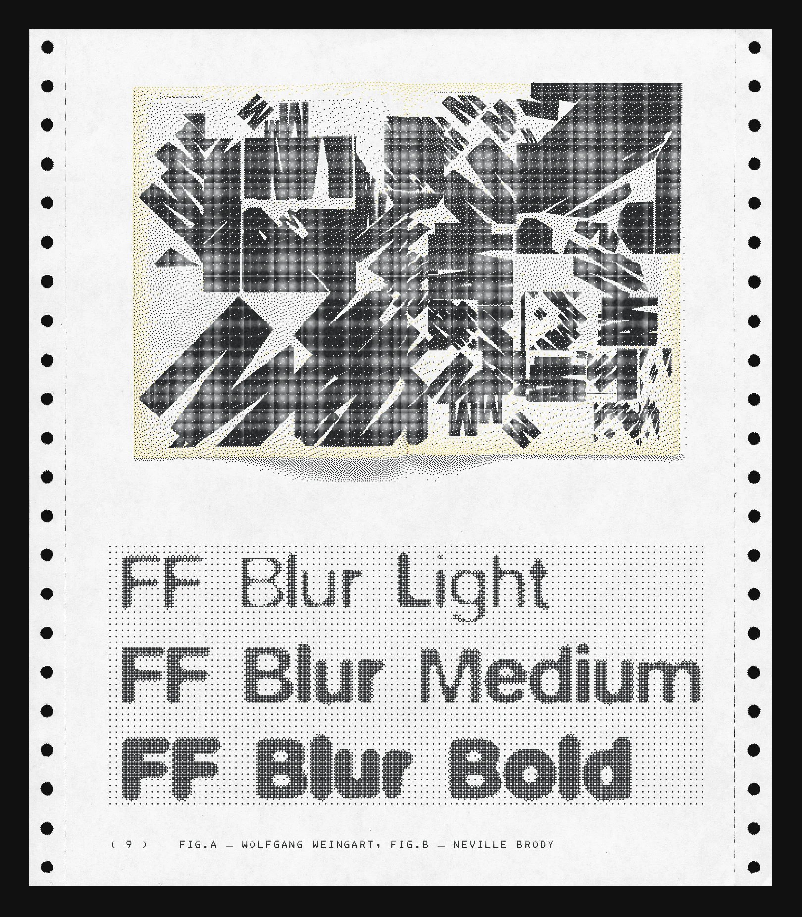
( 9 ) FIG.A — WOLFGANG WEINGART, FIG.B — NEVILLE BRODY
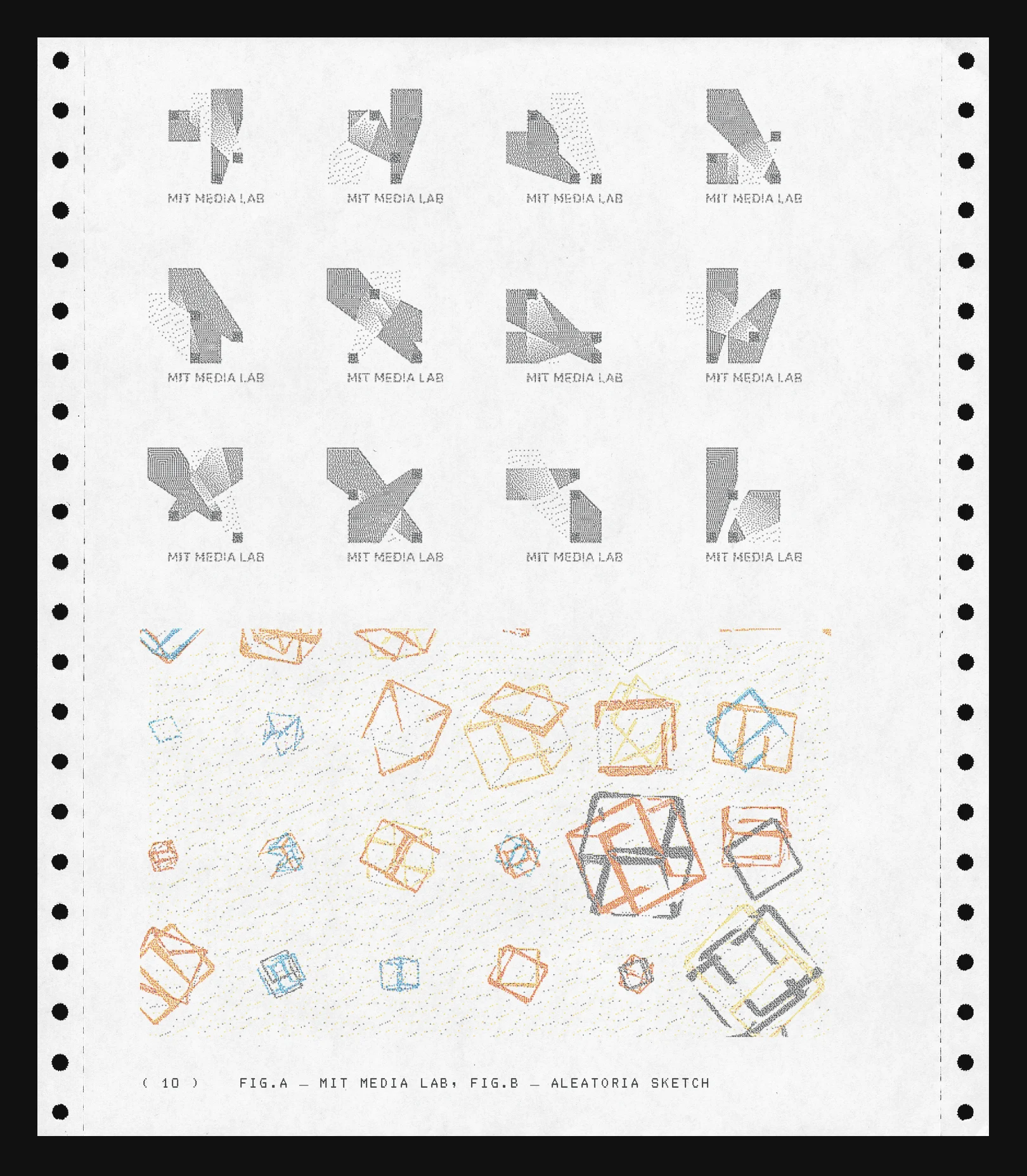
( 10 ) FIG.A — MIT MEDIA LAB, FIG.B — ALEATORIA SKETCH
Jan: So even though this generative system was at play from the start, we
announced Raster without it. As with many things, we were a bit
optimistic with the timeline for this first version of the platform, so
our project ended up getting pushed back to 2026. I’m really glad that
happened, as it would have been a shame to rush it, and I think the
project needed some extra time to mature anyway.
Can you talk a bit more about the final version of the system and how
it works?
John: Sure .. well it still has the basics from that initial sketches. The
base idea is that each letter is made from a grid of pixels. Within
that grid, each pixel can stay whole or be subdivided. Those
subdivisions can scale up or down, and pixels can also exclude one
another, which creates these different shapes and overlaps. Each pixel
can also round itself, so it can move between a square and a circle.
The real challenge was creating a large scale generative system that
could house 1,000 to 10,000 unique outputs so i added variables where
the grid within each letter can reorient, the pixels can blur into one
another, the system can apply one set of variables across the whole
word, or each letter can have its own set of variables.
So you can get a wider variety of outputs that are still safeguarded to
read as a “logo” (even in abstract cases!)
( 11 )
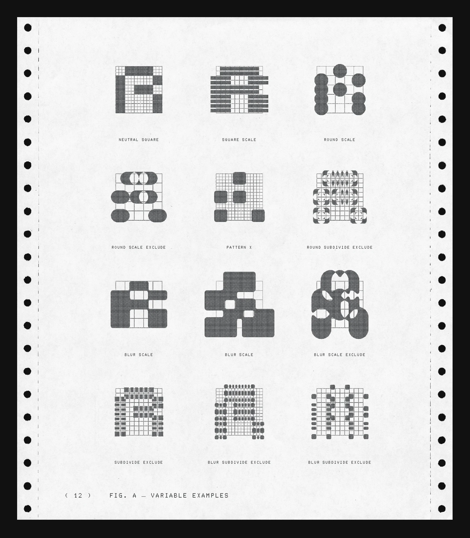
NEUTRAL SQUARE SQUARE SCALE ROUND SCALE
ROUND SCALE EXCLUDE PATTERN X ROUND SUBDIVIDE EXCLUDE
BLUR SCALE BLUR SCALE BLUR SCALE EXCLUDE
SUBDIVIDE EXCLUDE BLUR SUBDIVIDE EXCLUDE BLUR SUBDIVIDE EXCLUDE
( 12 ) FIG. A — VARIABLE EXAMPLES
Jan: I remember that the gooey merge (or blur) variable and the random
variations between letters opened up a lot of new visual variety. All
of a sudden the randomise button became a lot more addictive.
What about colour – I actually don’t know how you landed at this
specific shade of grey. Could it have been any of the 49 other ones?
And why did you not include some more expressive colours in the end?
John: HAHA hmm yea I think this specific grey was used in some early sketches
in response to the purely black and white wireframe you had. I think
the logic was the sight felt really contrast heavy with all the work
and the grey helped to soften things.
For the generative piece, we tried a few color explorations but
ultimately Raster is a platform for artworks so it was important that
the identity could live on the website without competing too much with
other work.
Gray has been a key part of the visual language constant throughout the
project for this reason. The website has used this grey plus a black
for dark-mode and white for light-mode so i thought it would be nice if
the outputs could mirror that.
The generative system can create enough variation without color, so I
kept the color outputs restrained.. It lets the logo become more active
when it needs to, but it can also sit in the background.
( 13 )
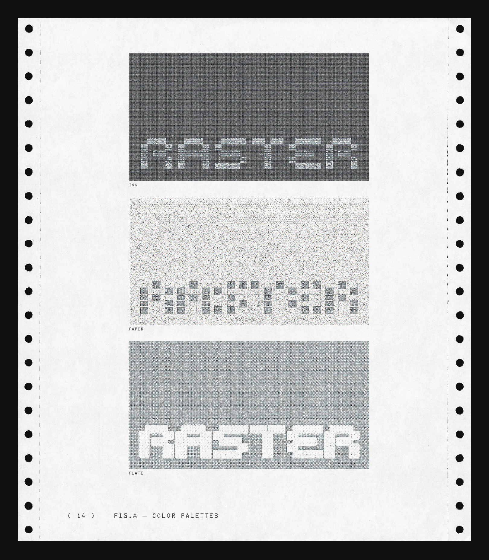
INK
PAPER
PLATE
( 14 ) FIG.A — COLOR PALETTES
Jan: I want to thank you for collaborating with us on this project. It’s
pretty amazing for Raster, only one year in, to be set up with such a
unique logo system. I also think it will be fun for our collectors to
mint these beautiful design objects that double as timestamps of their
early support for Raster.
From a personal perspective, it feels like a full-circle moment as it
was generative art that made me commit to this whole space in the first
place, and I learned a lot from you throughout this process. I really
hope we can find another way to collaborate in the future.
How do you feel about the collaboration and where the project ended up?
John: Yea likewise! I don’t think I would have done a project with anyone
else. I knew that you and Michael would be very open to ideas and
implementing things in an interesting way. I think that’s one of the
more interesting parts of it, because the project sits somewhere
between a branding project, an artist collaboration, a generative
artwork, and art direction. It feels very unique to me to experiment
with the structure.
And I like that the generative project can exist beyond just being an
artwork. It also becomes part of how Raster presents itself to people
and interacts with people who use it. It’s like the generated artwork
is a business card.. Which is why it’s designed like this “card” lol.
I’ve been thinking about it as a sort of handshake between Raster, me
and the people that use it.. To express our shared interest in
generative art being a part of the graphic DNA.
Thank you for inviting me to collaborate on the project :-}
( 15 )
( 16 ) 09.03.2026, BY JOHN PROVENCHER X RASTER