TypoWarsaw
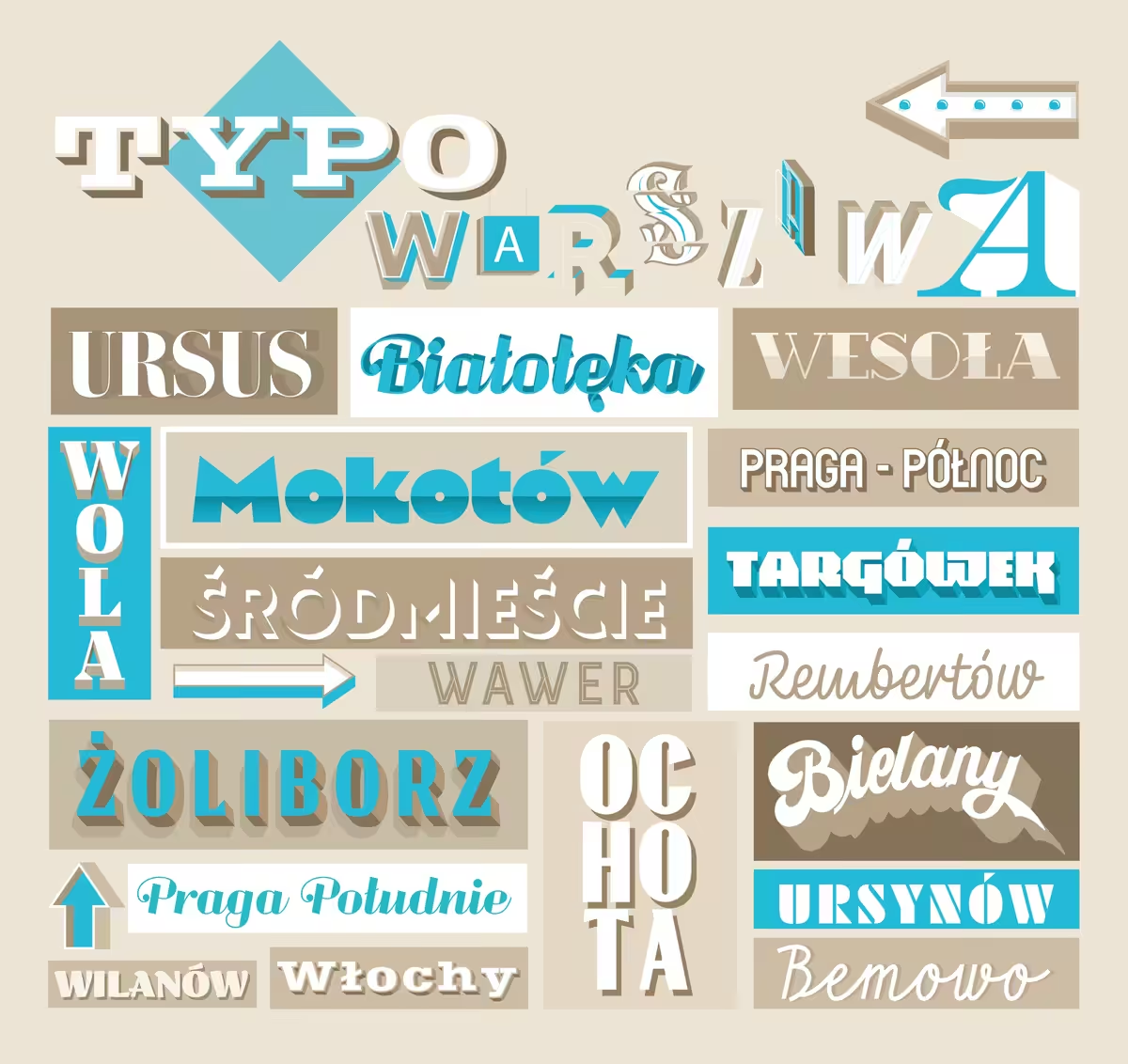
This project was inspired by Polish typography tradition and worldwide culture of sign art. The design is based on fonts from the initiative Kroje.org, which is dedicated to Warsaw’s typography traditions.
The concept of it was originally developed by @typowarszawa, who also happens to be Good Looking Studio’s creative director. The collage shows 18 different fonts, each of them being used to write the name of a borough from our beloved city.
We love letters as much as we love this city, so we did it with no sponsorship, painted in the center of Warsaw, to remind its citizens how beautiful our local sign art can be.
5386x5082.jpg
Edition 20/20
More pictures here :
https://www.facebook.com/media/set/?vanity=goodlookingstudio&set=a.1516938411697061
http://www.kroje.org
https://www.instagram.com/typowarszawa