SWEETSHOPS
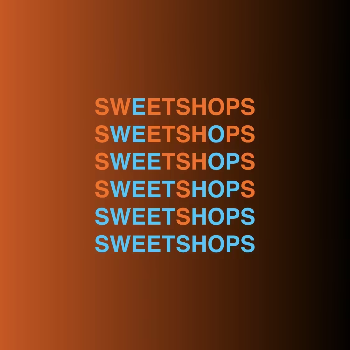
This is an example of an asymmetrical syntax crystal. The peaks of the crystals do not start on the same line. The first one starts before the second and creates a taller peak. The use of the teal color brings out the contrast to the other letters that are not part of the peak scheme. These background letters are somewhat related to the background gradient to further push the peaks forward. The uniqueness of how the letter cascade downward is part and parcel of this technique. Just like crystals we find from within the earth (a crystal consists of matter that is formed from an ordered arrangement of atoms, molecules, or ions.), every syntax crystal word will look completely different based on the letters, spelling combinations, or grammar. Now if I could only make these 3 dimensional like a real crystal. Hmm...future projects perhaps.