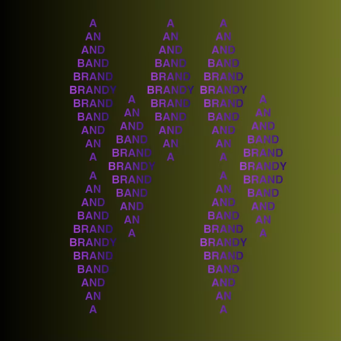
BRANDY
Andrew David Baron , 2021 — on hic et nunc
Ed. 1/50
Description
BRANDY is the first attempt to play with the concept of asymmetry within the concept of syntax crystals. The font size has been lowered in order to fit more crystals onto the page. Odd numbers always work great to create a sense of imbalance compositionally. We can place these in a certain order that still retains the essence of being part of the whole. The areas of absence create pockets of negative space and draws the eye around the page. I was thinking about having some of them trail off the page, but eventually opted for a more conservative approach. I wanted to have the feeling you're looking at a sample or piece of crystal that broke off from another crystal. A fun experiment, but next time let's get radical.
On-chain
Market
Provenance
Collectors